

There’s a certain safety and reassurance about dark colours. It’s easy to fall back on navy, black and grey, particularly when that same colour palette is reflected in the long nights and cold days of winter. We’ve been told that there’s something grown up, serious and austere about eschewing colour in favour of darker, more “hardworking” items.
Let the Light In - A Guide to Summer Colour
But the weather is changing, the promise of summer is appearing on the horizon, and those darker tones just won’t cut it anymore. If only it were that simple. It can be difficult to know how to approach colour in your wardrobe, all too easy to return to the tried and trusted monochrome you’ve been wearing all winter.
"Embracing colour doesn’t have to mean throwing your normal rules out of the window in favour of bright clashes and technicolour assemblages."
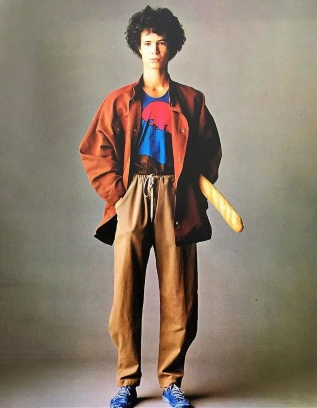
Embracing colour doesn’t have to mean throwing your normal rules out of the window in favour of bright clashes and technicolour assemblages. In fact, there are very few people who can pull off the maximalist approach to colour. Think of David Hockney – in his checked suit and yellow crocs – and you’ll realise that maybe that only works if you’re an octogenarian artist.
Instead, you can introduce colour to your summer wardrobe in a more subtle way. The right flashes of colour are a way to accentuate your ‘fit, not overwhelm it. Brands like Ralph Lauren and Armani are some of the best to ever do it, pioneering new colour combinations and injecting traditional staples – button-down shirts, classic knitwear, relaxed suits – with new meaning, through the use of unexpected colours. The late, great Issey Miyake did something similar, creating pleated suits in everything from dusty purple to bold red.
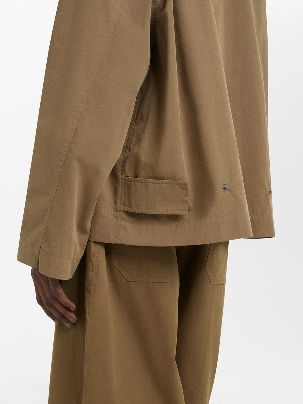
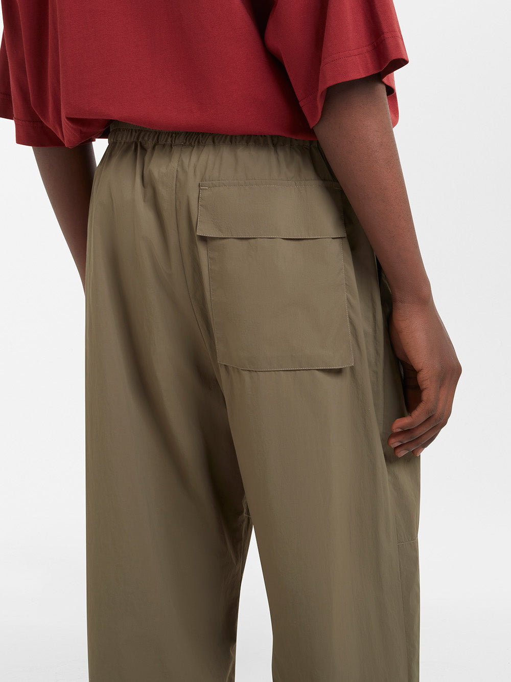
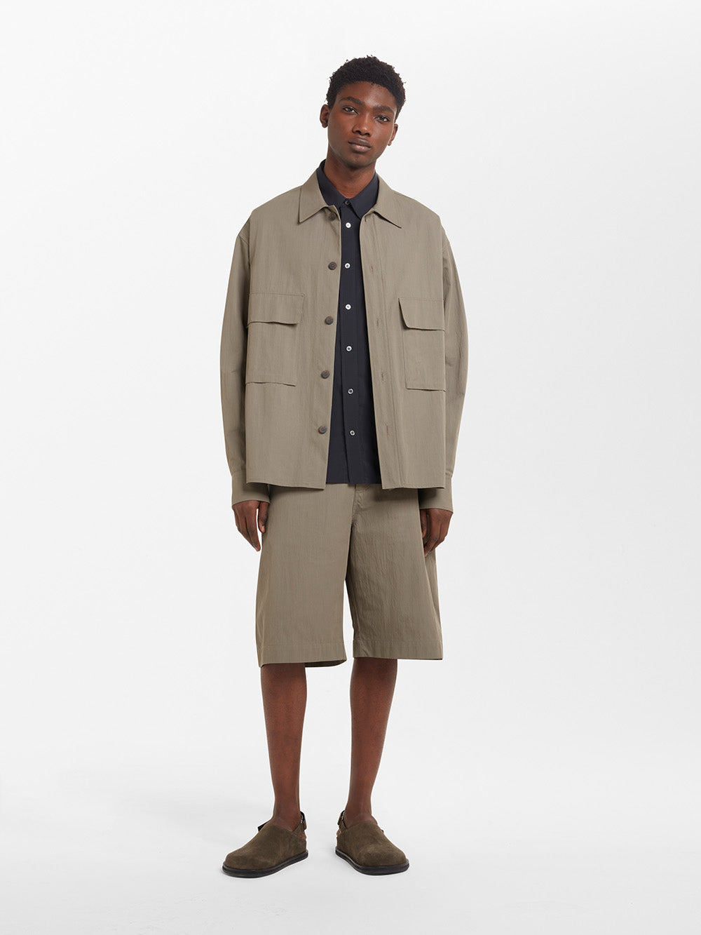
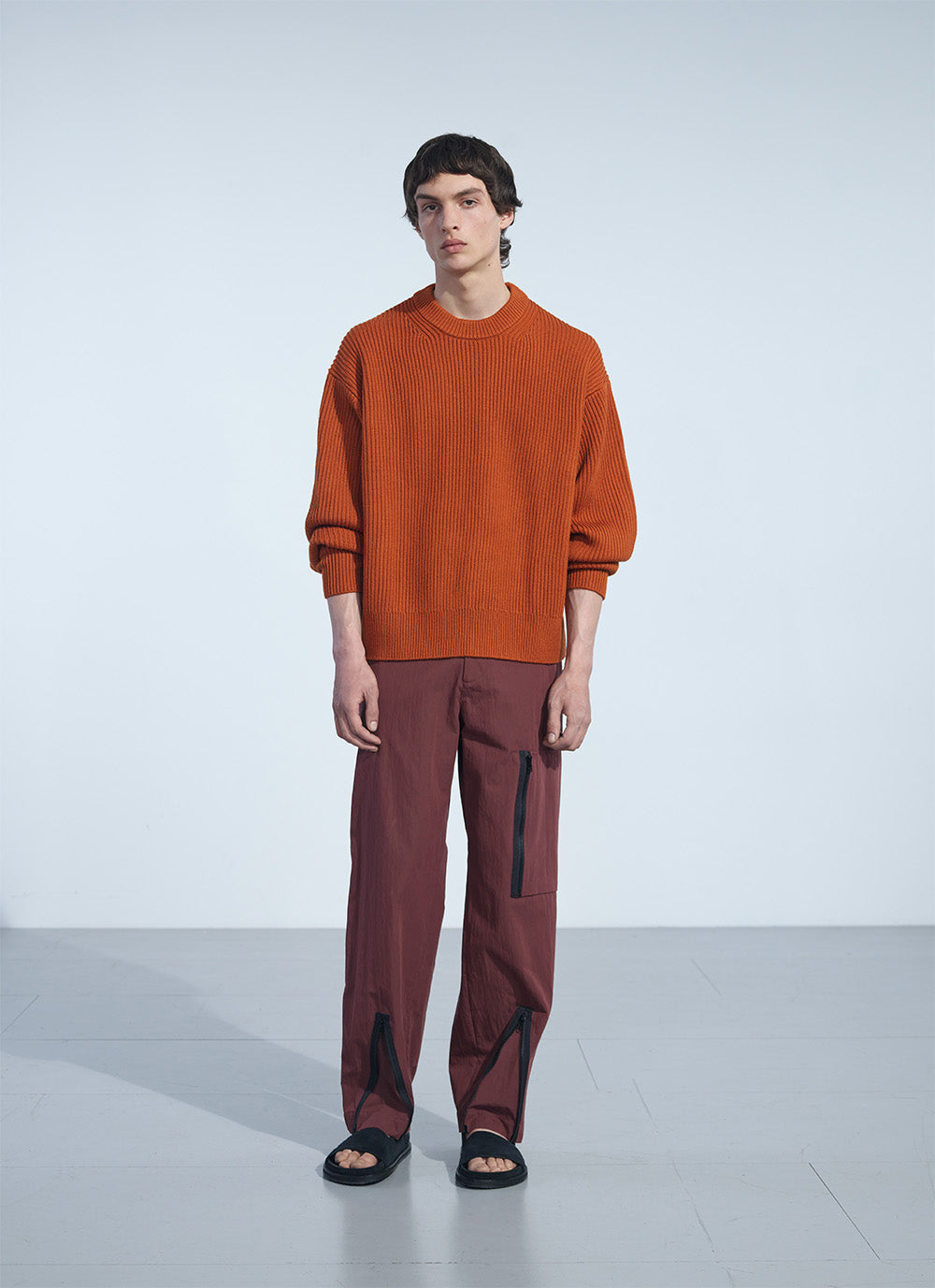
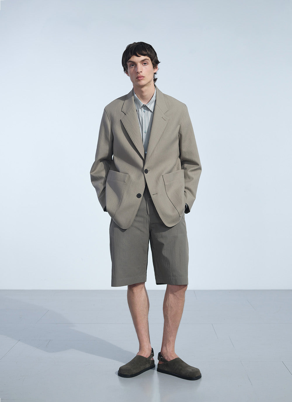
That ethos is carried through to Studio Nicholson’s approach to colour. The Spring Summer ‘23 men’s collection references the rule-breaking New York culture and the effortless elegance of Armani’s early years. The duality of elegance and rebellion is reflected through a colour palette that introduces earthy tones like Almond, Soil or Olive alongside pops of brighter colours, including an oversized madras check that combines pinks, purples and blues. None of these colours hijack what you’re wearing, instead, each one offers an injection of personality into your outfit, complementing your existing staples.
"As with all sartorial decisions, the secret to bringing colour into your wardrobe subtly lies in layering."
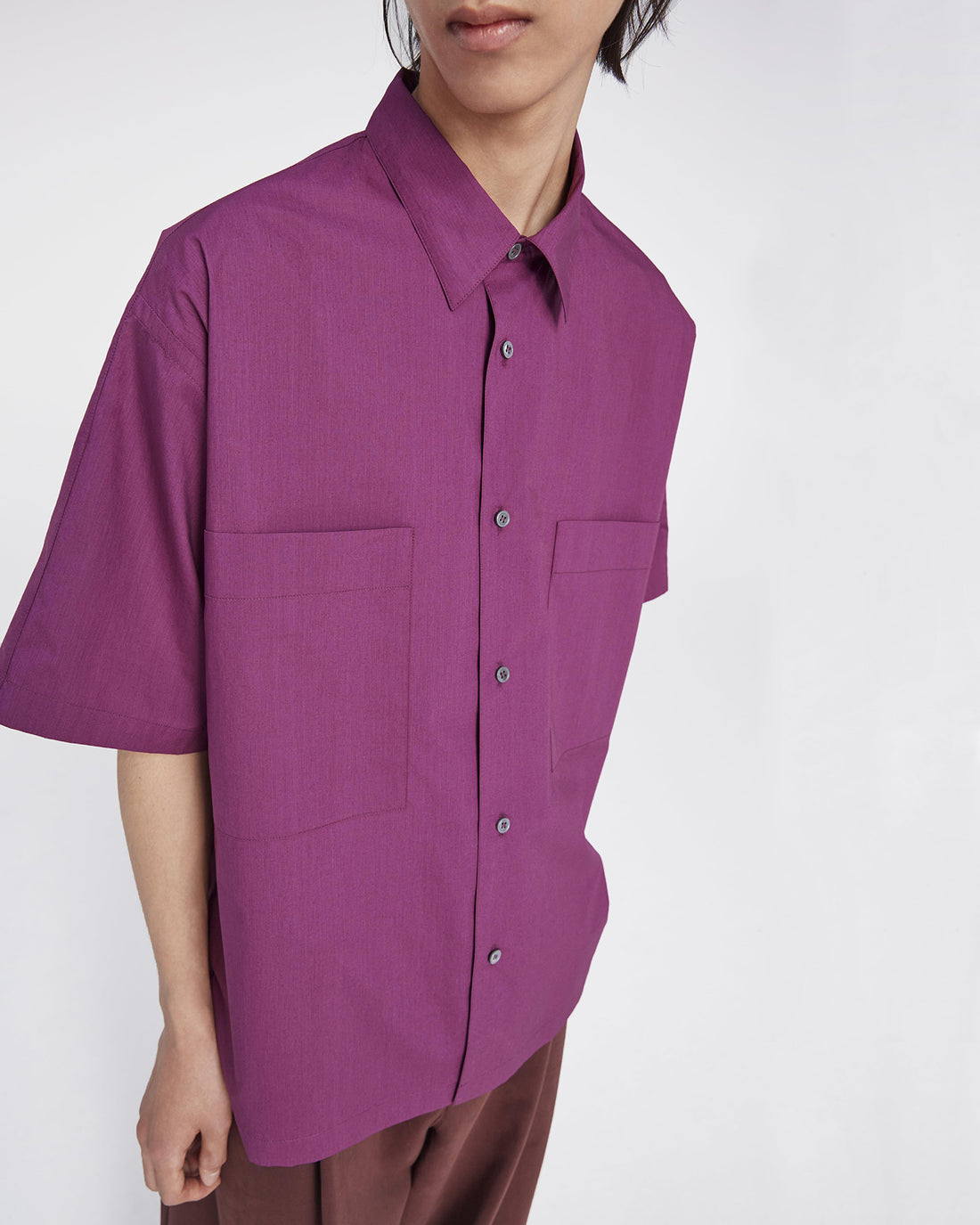
As with all sartorial decisions, the secret to bringing colour into your wardrobe subtly lies in layering. New combinations can make your modular wardrobe feel fresh without needing an entire overhaul. The addition of a Ceilo cardigan in Almond – slotting in nicely under your coat – or an Eurus shirt in Berry, elevating the crisp white tee beneath, can revolutionise what you’re wearing. Adding a hint of colour makes an outfit less formal and more playful, softening the edges of an otherwise austere muted colour palette; those madras check Haul shorts or a denim jacket in Ice Blue can serve as a reminder not to take things too seriously.
While the change of season is the perfect time to allow more colour in, brighter tones are not limited to the brighter months. Recent years have seen a new buzzword introduced to the fashion lexicon, but unlike most throwaway trends and fads there might be something to “dopamine dressing.” Put simply, it’s the idea that wearing clothes you love is the secret to happiness, and brighter colours are an important part of that. That’s as important in February and March as it is at the height of summer.
Spring is a time for new beginnings, an opportunity to throw off the shackles of winter and let more light in. That applies as much to your clothing as it does to anything else. Adding pops of colour – whether that’s Chestnut knitwear or outwear in Klein blue – is the perfect way to freshen things up and build a modular wardrobe that’s good for all weather.
Jack Stanley


