


Of all the hues in the colour wheel, there’s something eternally enticing about blue - each shade conveys a slightly different message. Our trusted navy, a staple in everyday closets, is understated and has enduring appeal; a true midnight navy shade is so dark it’s almost black. In contrast, cotton chambray in shades of light blue tend to feel fresh and springlike. But what about that brilliant hue of bright blue, the one that French artist Yves Klein fell in love with? That’s something else.
Born in Nice in 1928 into an artistic family — his parents, Marie Raymond and Fred Klein, were both painters — Yves Klein became enamoured by blue one hot day in 1947. He was on the beach in the south of France with a couple of friends, and they lay gazing at the sky. So profound was the meditative state he found himself in, whilst looking up at that vast expanse of blue, that he decided he would paint it.
That moment was to inform his entire career — he went on to create over 200 blue paintings, each limitless in their use of blue; entire rectangle canvases covered only in the bright blue pigment, or splashed up on paper like a wave just before it crashes back into the sea. The shock of blue in a Klein painting is primal, instinctive — you look at it and it sucks you in and swallows you up. It’s sort of like jumping into the depths of a swimming pool.
But it wasn’t any old blue that Yves Klein used; his was so distinct that he created his own version. He patented it IKB — International Klein Blue. He loved the colour so much that in 1960, at the opening of his Anthropometries of the Blue Epoch exhibition in Paris, he directed three naked models to roll around in blue acrylic, acting like human paint brushes.
Blue then, is one of the most expressive shades on the spectrum. That brilliant Yves Klein blue hue, is something of a palette cleanser; a shock of unexpected blue that instantly lifts our spirits.
Other artists too have used blue it to convey some sort of opulence. 17th century artist Johannes Vermeer loved it; the ultramarine paint pigment he used was incredibly expensive. (When the share first appeared as a paint in the 6th century — it was widely considered as a treasure that was equal to gold). Vermeer used it in all 36 of his life’s artworks — he couldn’t paint any more than that, because well, he couldn’t afford it.
When he did use it though, he liked to use it for clothes. The Girl with a Pearl Earring (1665) wears a super wide blue headband, that probably cost more than her pearl; the woman in Woman Reading a Letter (1663) wears an oversized, A-line painters’ jacket we, quite frankly, wouldn’t mind hanging in our own wardrobes today. Perhaps Vermeer missed his true calling as a designer.
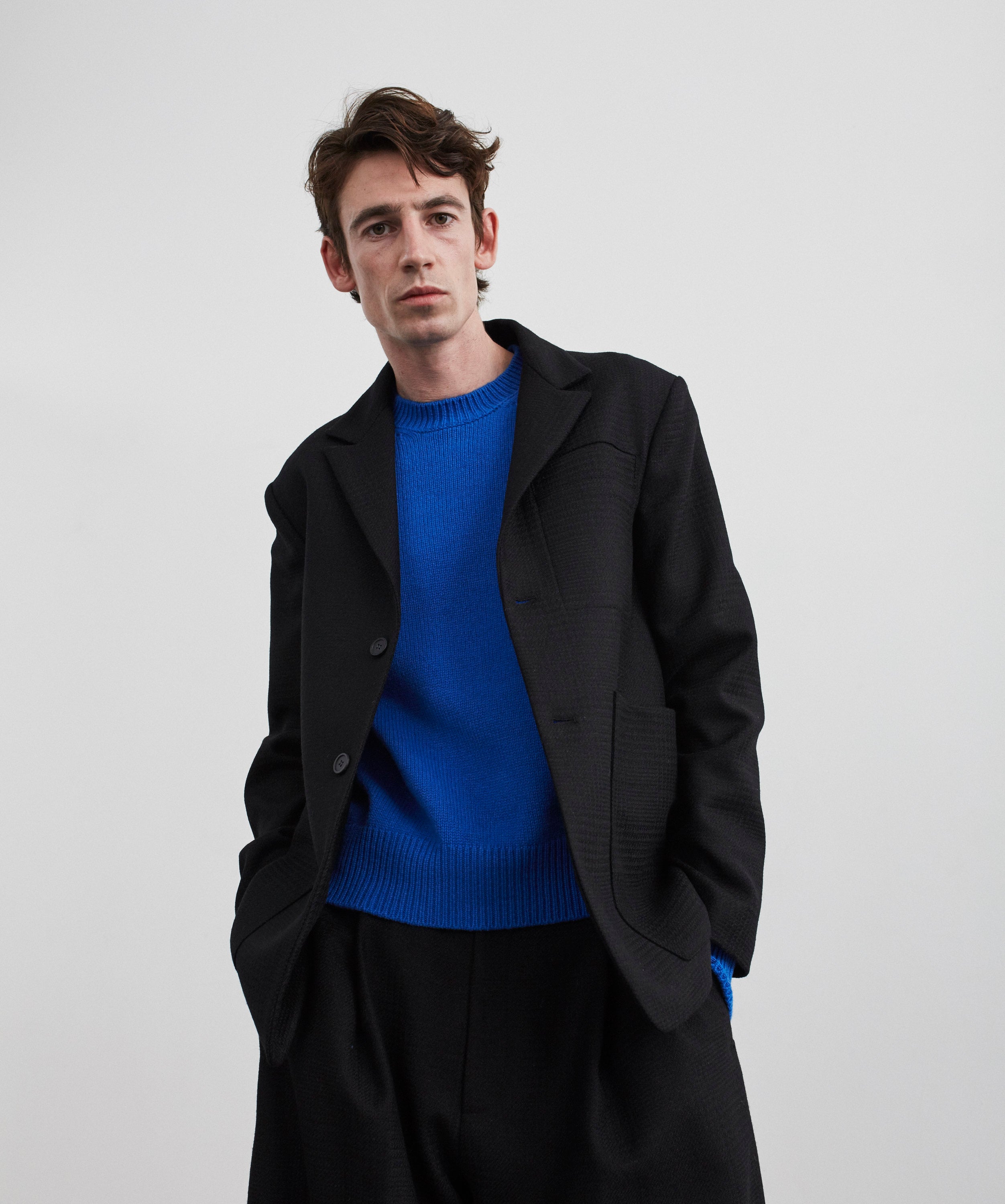
Ultramarine, then, has always been great in clothes. This season, Studio Nicholson has dived deep into the blue, with Klein blue turtleneck tees, lambswool cardigans and cotton T-shirts providing an ideal tonal contrast to our deep, dark navys; it’s an easy way to add colour into everyday wardrobes without falling too far from our signature hues. The Moonstar sneaker, crafted in Japan, allows you to build your palette from the ground up; a shock of bright blue, replacing an off-white sneaker, feels a lot like hitting refresh — an ideal state of mind for the forthcoming autumn season.
Grace Cook, Fashion writer at the Financial Times
